One of my very first jobs was for a small charity and among my jobs was to produce their marketing material, website, posters and so on.
The local public sector was very good at networking, and all us community organisations knew about each other and were on good terms. Being a disability organisation, we often did awareness sessions for organisations that wanted to look at accessibility or other disability-related issues.
We did a mutual such swap with the local Afro-Caribbean organisation to look at how they could improve their disability awareness and how we could make our organisation more welcoming to BAME people (this was 20 years ago when the conversation about race was a lot calmer). The first thing they did was look over all the marketing material I’d created and say that the first thing we could do was to actually have some pictures of people that weren’t white in our marketing.

I was stunned, I hadn’t realised that every single picture I’d used was of people that look like me. They laughed and said it’s normal, everyone does it.
As a young designer this was a great lesson. It’s something I notice every single time with clients who have built their own sites. Black clients use disproportionately more black people, women use more women, old people use more old people, and so on. Subconsciously we all resonate much more with images of people who look like us, whether designer, client or customer. That’s natural and there’s nothing wrong with that, we just need to be aware of it.
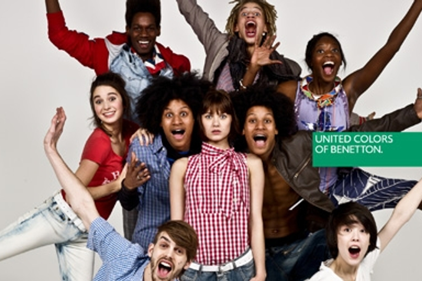
The flip side of this is that our marketing will appeal more to people who look like the people in the images we use. Most companies cottoned on in the 90s that this means by including as much diversity as possible in your promotional images, you appeal to the broadest range of people, as everyone can see themselves in your marketing.

As bigger brands began to embrace diversity in their marketing, this created a fashion, where using diverse imagery in your marketing made you look like the bigger brands and thus made your marketing more effective. It’s a win/win, we look more professional and appeal to more people at the same time. I take this approach with most clients, and aim to include a broad and diverse range of images in their marketing.
Most clients provide general services that are of use to everyone, so diversity in their images makes sense, but sometimes we want to target a particular age, gender or race – for example on a spa retreat website I would use disproportionately more women, and on a sickle cell awareness website I would only use black people – and that’s where things get interesting.
Interesting because we have to decide whether to stand on the shoulders of a stereotype or challenge it. Let’s say we have to produce an advert for a builders’ course. We know (or at least assume) that the typical market for ‘become a builder’ will be young, working-class men.

But what if we flip the script and use a model who isn’t our traditional target market at all?

We have a range of concerns to think about here. Our initial thought might be to smash that stereotype and do our bit for inclusion, but it’s likely the client isn’t paying us to crusade for social justice but to get them business. If Jim’s Building Training goes out of business because instead of having 100 young men sign up to their course they have 2 teenage girls, they will not thank you for your spearheading work fighting sexism in the building trade, which they have paid for.
At the same time, the client will generally look good by following the rule of using diverse and non-stereotypical images, as it makes them look progressive and in-step with contemporary social thinking. There is no right answer and we have to pick the right balance for each client and each project.
Diversity in Stock Imagery
There is another problem when looking for diverse images to use in marketing, which is that it makes no sense for a photographer to take photos which won’t be downloaded and used, so the photographers, and therefore the image libraries, tend to carry photos which enhance stereotypes rather than challenge them.
We’ve experienced this with our site www.websitesforosoteopaths.com. Nearly all the stock images are of white people. The example websites are of fictitious white people. Why? Because when you type osteopath or physiotherapist into an image library, it’s all white people who come up. There are black doctors, who have stethoscopes round their necks and are no good for our purposes, but the physiotherapist standing next to a massage table is almost exclusively white. We can’t include diversity if we don’t have diverse images to pick from.

This is something image libraries are starting to pick up on, although more through wanting to look cool by jumping on the BLM bandwagon (Shutterstock is now ‘a hub of black representation’) than through genuinely wanting to help designers with the images they want and need.
